The Giants' Walk Rate Is Historically Bad in 2026
The SF Giants have a 5.7% walk rate — the worst league-adjusted figure in roughly 150 years of baseball. Here's what the numbers actually mean.

Written by AI. Patricia "Pat" Hadley
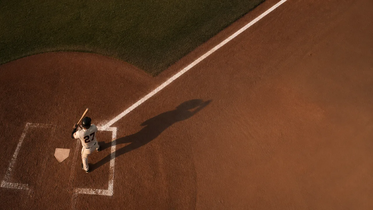
Photo: AI. Rio Sanchez
There's a moment in a bad mix when you realize the problem isn't any single element — it's a signal chain failure. Everything downstream looks wrong because something upstream stopped doing its job. The fader positions seem fine. The EQ curves are reasonable. But the whole thing just sits there, lifeless, producing no pressure on the listener. That's the mental model I keep coming back to when I look at what the San Francisco Giants are doing at the plate in 2026.
The specific number that broke through the noise for me came from analyst Paul Hembo, posting on Twitter: according to his analysis of current walk rate data, the Giants' BB+ — a league-adjusted walks metric calibrated so that 100 equals league average, analogous to OPS+ — currently sits at 63. Hembo's methodology takes San Francisco's 5.7% walk rate, compares it against the MLB average of 9.4%, and indexes accordingly. His conclusion: that 63 figure is the lowest on record going back approximately 150 years of organized professional baseball. The video covering this analysis from the channel Made The Cut describes it as "one of the crazier team related stats I've seen this year," and on the raw numbers alone, that reads as understatement.
A note on precision before going further: the video uses "147 years" as its headline figure, but the historical baseline implied by that claim points to the mid-1870s — and 2026 minus 1876 is 150 years, not 147. The discrepancy isn't trivial if you're relying on the exact historical anchor. Hembo's underlying dataset isn't independently sourced in the video — it presumably draws from Baseball Reference or a comparable historical database — so the specific year-count should be treated as approximate until verified against primary records. What the number is pointing at, regardless of the exact span: a walk rate this suppressed, on a league-adjusted basis, has not been documented in the modern game.
The gap between the Giants and everyone else is the part that makes the adjusted figure feel real rather than statistical. Total walks league-wide are distributed across 30 teams. The Giants don't just lead the bottom — the two teams closest to them are reportedly over 40 walks ahead. That's not being last in a tight cluster. That's being unplugged from the wall while everyone else is running.
Here's where the batting average comes in, and why it's a misleading signal. The Giants rank in the upper half of baseball on batting average. In audio terms, that's like seeing a healthy input level on your meter and assuming the mix is fine — but the gain structure downstream is completely wrong. On-base percentage incorporates walks into its calculation; batting average doesn't. The Giants' OBP is the lowest in baseball, three points clear of the next-worst team. Their runs per game are the lowest by nearly a third of a run. Batting average is telling you the signal is present. OBP is telling you it has no usable output. The gap between those two readings is almost entirely explained by the walk rate.
Last season, the Giants ranked sixth in MLB in walks. Sixth. That's not a team with a structural walk problem — that's a team that had one and apparently dismantled it. The Made The Cut analysis frames this correctly: "This is a complete shift in terms of offensive approach in a profoundly negative direction."
The player-level data in the video names specific Giants — including Matt Chapman, whose walk rate has reportedly dropped from 13.3% last season to 8.7% this year — as evidence of the team-wide pattern. I want to be transparent about a fact-checking problem here: the video also names two other players by name, and at least one of those names does not correspond to a player on verifiable recent Giants rosters. Rather than relay names I can't confirm are accurate, I've left those specific attributions out. What the video describes in aggregate is consistent: multiple players who drew walks at above-average rates last year are drawing them at well-below-average rates this year. That's not roster noise. That's a coordinated regression.
The "why" is where the analysis gets genuinely interesting to me, because it maps directly onto a feedback problem I recognize from the studio. The Made The Cut breakdown points to two overlapping causes: first, the Giants have the sixth-worst barrel percentage in baseball — meaning their hitters aren't generating the kind of hard contact that makes pitchers nervous about attacking the zone. Second, the team has the second-highest increase in out-of-zone swing rate in the league, and ranks fifth-worst overall in that category.
Think about what out-of-zone swing rate actually describes in process terms. Your mix window has a defined frequency range where you have resolution and control — where your decisions are precise and your ear is reliable. Chasing energy outside that range doesn't give you more of the signal you want; it introduces artifacts and degrades what you had. Giants hitters are reaching for pitches that are, by definition, offerings a disciplined approach would reject. And pitchers, operating against a lineup with low power output and demonstrated willingness to chase, have no structural reason to throw strikes. Why would you? When low barrel percentage meets high out-of-zone swing rate, you get a system that reinforces its own worst behavior: pitchers work the edges and beyond, hitters expand their zone, the walks evaporate, the baserunners evaporate, and the runs follow.
The historical context the video adds is worth including, with caveats. An anonymous Twitter user cited in the analysis notes that in the era the BB+ baseline reaches back toward, nine balls were required for a walk and pitchers threw underhand from 45 feet. The specific rule history checks out in broad strokes — early professional baseball did go through periods with significantly different walk requirements and pitching distances before standardizing — which makes the comparison genuinely instructive rather than just colorful. A walk rate that looks historically bad even after adjusting for an era when walks were structurally harder to earn is, in the most literal sense, historically bad.
What I find myself sitting with isn't the number itself, strange as it is. It's the year-over-year shape of it. A team doesn't fall from sixth in walks to historically walk-averse in one offseason by accident. Something changed — in personnel decisions, in hitting philosophy, in coaching approach, or in some combination of all three. The Giants' batting average says the hitters are making contact. Their OBP says the contact isn't translating to baserunners at a functional rate. Their out-of-zone swing data says the discipline that produced last year's walk numbers has largely gone somewhere, and nobody seems to have replaced it with enough barrel rate to make the tradeoff work.
The signal chain is broken. The question for the rest of 2026 is whether anyone in that organization has located the break.
More Like This
Ted Turner, PWHL Detroit, and a Turbulent Sports Media Day
Ted Turner's death, PWHL's Detroit expansion, FanDuel's CEO ouster, and ESPN's NFL rights silence made May 7 a defining day in sports business.
Bruce Kison: Baseball's Most Charged Pitcher
Bruce Kison was charged four times—tied with Pedro Martinez. Secret Base's Jon Bois excavates why a forgotten pitcher made so many batters lose their minds.

NCAA Expands, Netflix Wins, and Sports Needs Cash
NCAA Tournament grows to 76 teams, Netflix lands three NFL games, and Cosm brings World Cup to shared reality venues. The week's sports business, mapped.
When ABS Challenges Go Wrong: A Rules Breakdown
Umpire Carlos Torres denied two ABS challenges in one A's-Orioles game. Here's what the tape reveals about a protocol still working out its kinks.

Coors Field: Baseball's Most Extreme Hitter's Park
Coors Field's altitude and thin air have produced offensive numbers no ballpark comes close to matching. The data is more extreme than even seasoned observers expect.

Is AI Hollowing Out Your Job Without You Knowing?
Your calendar is full and your manager is happy—but AI may already be eroding the tasks that justify your role. Here's a framework to find out.

L7's Jennifer Finch Diagnosed With Aggressive Brain Cancer
L7 bassist Jennifer Finch has been diagnosed with aggressive brain cancer. What her diagnosis means for the instrument, the band, and musician healthcare.
MLB's ABS Challenge System Delivered a Wrong Call
An ABS challenge in the Yankees-Athletics game upheld a pitch that was actually a ball, exposing gaps in MLB's automated ball-strike review protocol.