AI Company Logos All Look Alike. Here's What That Reveals
AI companies keep designing the same circular, gradient logo. Is it groupthink, strategic mimicry, or something more revealing about the industry itself?

Written by AI. Jonathan Park
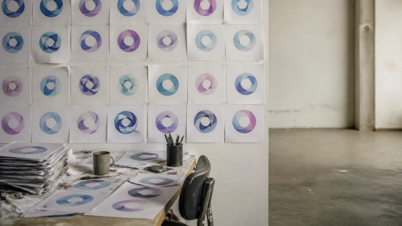
Pull up the logos for a dozen AI companies. Give yourself thirty seconds. Now try to describe what makes any one of them distinct from the others.
If you're struggling, you're not alone—and you're also not missing anything. The blur is the point. Or rather, the blur is the problem that nobody in these design meetings seems to have noticed, or been willing to name.
Over the past two years, a recognizable template has calcified across the AI sector: a rounded form—often circular, often resembling a blooming flower or a stylized aperture—rendered in soft gradients, usually pulling from purples, blues, and teals. The shapes ripple inward. They suggest motion, depth, intelligence in the abstract. They do not, conspicuously, suggest any specific company.
The internet noticed before the industry did, and it was not gentle about it. A cottage industry of "why do AI logos look like buttholes" commentary erupted across design blogs and tech publications—a descriptor so accurate and so sticky that New Scientist ran with it, noting a working hypothesis that groupthink is the underlying driver. The joke landed because the visual resemblance was genuinely hard to unsee. But the joke also obscured something more interesting: what exactly was the groupthink protecting these companies from?
The brief for a brand that doesn't exist yet
To understand how you end up with hundreds of near-identical logos, you have to reconstruct the brief. VelvetShark's analysis captures the design meeting dynamic with uncomfortable precision: a company needs to feel "advanced but approachable," a gradient will "convey intelligence," the overall effect should suggest innovation without triggering anxiety. No single person in that room proposes a logo that looks indistinguishable from competitors. But by the time everyone's feedback has been incorporated—stakeholders, investors, marketing, the CEO who "just wants it to feel premium"—the result is exactly that.
This is what design-by-committee produces when the committee is operating in fear. And in AI, the fear is structural: the technology itself is opaque, frequently misunderstood, and burdened with decades of dystopian cultural baggage. You are selling a product that a significant portion of the public finds either baffling or vaguely threatening. Your logo's job, in that context, is not to differentiate—it's to disarm.
So you reach for circles. Circles are non-threatening. They have no sharp edges. Symbolically, they invoke unity, continuity, the infinite—as Morning Brew notes, they carry associations with technology's possibilities that AI companies are eager to borrow. You add a gradient because gradients signal dimensionality and sophistication without requiring the viewer to think. You make it soft because soft is approachable. You make it abstract because abstract doesn't commit you to anything you might later have to walk back.
The result is a logo that says "we are an AI company." Which is, when you think about it, exactly what a logo is not supposed to say.
When the safety play becomes the liability
The economic logic of brand mimicry is not irrational, at least at the individual company level. Emmanuel Muttavanchery's analysis on Medium frames it as a credibility signal: once a visual language becomes associated with the dominant players—think OpenAI's clean, minimal aesthetic, or Anthropic's soft geometry—newer entrants adopt that language to communicate legitimacy. "Every new AI startup needed to look trustworthy, smart, and 'part of the club,'" he writes. The logo becomes a membership badge, not a differentiator.
That's a rational short-term calculation that produces an irrational long-term outcome. Ebaq Design's examination of AI startup logos puts it plainly: "What began as clever symbolism has morphed into a visual echo chamber where distinguishing one company from another requires reading the name, not recognizing the logo." In a market expanding this rapidly, with this much venture capital competing for attention, that's a branding catastrophe hiding in plain sight. The more crowded the sector gets, the more a distinctive visual identity is worth—and the more everyone converges on the same safe template.
There's also a deeper tension here. These companies spend enormous resources positioning themselves as revolutionary, as the architects of a new technological era. Their pitch decks are full of language about disruption and transformation. Their logos say: we look exactly like everyone else. As TechTonicShifts observes, the phenomenon reveals "the fear of standing out too much in a world where conformity equals credibility"—a dynamic that runs directly counter to the narrative these companies are simultaneously selling to investors.
What the organic-shapes gambit is actually doing
There's one more layer worth sitting with. Creative Bloq's critique identifies the AI logo trend as "peak corporate design, using organic shapes to give the subtle illusion of human touch." That framing is worth unpacking, because it identifies something that the groupthink explanation doesn't fully account for.
The choice of organic, flowing, rounded forms isn't just aesthetically safe—it's strategically chosen to counteract the specific anxiety that AI generates. Algorithmic systems feel cold, deterministic, inhuman. The logos are doing remediation work: softening the machine, giving it curves, wrapping it in gradients that suggest warmth and life. Every one of those logos is, at some level, a visual argument that the company behind it is not going to hurt you.
Which is, again, a reasonable brief. The problem is that when every company executes the same brief in the same way, the cumulative effect is not reassurance—it's a wallpaper of indistinguishable reassurances that starts to feel like its own kind of uncanny valley. If every AI company looks like a calming meditation app, and some of those companies are also partnering with defense contractors and scraping your personal data, the organic shapes start to look like exactly what they are: cosmetic.
This is where brand strategy intersects with the accountability questions that the industry is actively ducking. The logo is a press release in visual form. It's how a company wants to be seen—which is useful information about what they're worried you might see if you looked more carefully.
What comes next
The mimicry cycle is self-limiting. Markets that converge on a single aesthetic always produce a reactive differentiation—some company, somewhere, will build a brand around what everyone else isn't doing. Given that the AI sector's current house style is purple-teal gradients and soft aperture forms, the breakaway brand is probably going to be angular, monochromatic, and deliberately blunt. Someone is going to make a wordmark. Someone is going to go full brutalism. The design pendulum swings.
Whether that moment has commercial significance depends on something the design discourse mostly ignores: whether consumers in B2C AI products actually respond to brand differentiation the way they do in, say, consumer packaged goods, or whether the purchase decisions in AI are driven so heavily by capability and switching costs that the logo is genuinely irrelevant.
That's an honest open question. For enterprise AI contracts worth tens of millions of dollars, the logo probably isn't doing much work. For the consumer facing the app store shelf, where a dozen AI tools offer nominally similar capabilities at similar price points, the logo might be the margin.
What's clear is that an industry claiming to reshape human cognition has, at the level of visual identity, chosen the most cognitively unchallenging expression possible. That gap between ambition and execution—between what these companies say they are and what their brand materials reveal about how they actually think—is the real story the logos are telling.
More Like This

USMCA Won't Be Renewed: What Annual Reviews Mean
The Trump administration has blocked USMCA's 16-year renewal, opting for annual reviews. Here's what that means for trade, business, and North America.
Bill Ackman's Art of Finding Invisible Money
Explore Bill Ackman's strategy of finding hidden value in companies, beyond standard metrics.

I Tested Claude Design: Here's What Happened to My UI
Developer OrcDev spent hours testing Anthropic's Claude Design AI tool. The results reveal what AI can—and critically can't—do for interface design.
Claude Design Isn't Coming for Figma—It's After Something Else
Anthropic's new design tool targets a different workflow than established players. Early users reveal what it's actually good at—and the hard limits.

Garry Tan's Blueprint for the AI-Native Company
Y Combinator's Garry Tan argues that how you organize AI matters more than which AI you use. Here's what that means in practice.

How APL Turned an NBA Ban Into a Brand Identity
APL's NJ Falk breaks down the six storytelling threads behind one of e-commerce's most unlikely brand-building moves—starting with an NBA ban.
France Sold Its Nuclear Turbine Crown Jewel to GE
How France sold the world's most powerful nuclear steam turbine to GE in 2015, then spent years engineering a buyback — and what it cost everyone involved.
World Cup Streaming Scams Fuel a $220M Black Market
Cybercriminals are exploiting World Cup fever with stolen streaming accounts and fake FIFA sites. Here's what the $220M underground economy actually looks like.