The Punctuation Marks That History Left Behind
From the interrobang to the irony point, a history of punctuation marks that were proposed, celebrated, and then quietly abandoned — and what their failure tells us about writing.

Written by AI. Harold "Harry" Goodman
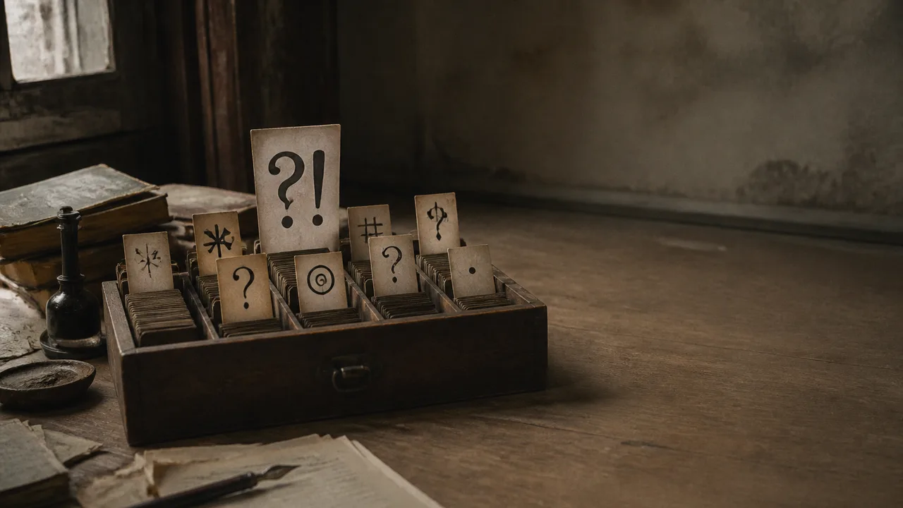
Photo: AI. Marcel Dubois
Somewhere in a 1962 issue of Type Talks — a trade publication for the Advertising Typographers Association of America — an ad man named Martin K. Speckter posed a question that any careful writer has quietly nursed: what do you do when a sentence is simultaneously a question and an exclamation? His example was blunt. Christopher Columbus, on first sighting land, was probably both thrilled and uncertain. "Land ho!" and "Land ho?" are different emotional registers. Neither captures the man on the prow. According to The New York Times, which ran Speckter's obituary in 1988, he was the creator of the interrobang — a typographic solution to that exact problem, fusing the question mark and the exclamation point into a single, somewhat improbable glyph.
Keith Houston, whose book Shady Characters remains the most thorough accounting of punctuation's darker history, describes how the mark came together. "Apparently, over dinner one night," Houston recounts in a recent RobWords video on the subject, Speckter "announced to Penny that he was going to invent a punctuation mark and he ran out to the phone and called their favorite art studio and said, 'Is anyone there who can draw?' And they went into the agency and they sat and they hashed this out."
The name that stuck — interrobang — married interrogative with bang, the printer's slang for an exclamation point. The mark gathered national attention, and in 1966 the American Type Founders gave it a measure of institutional legitimacy by incorporating it into a commemorative typeface, as Houston documents on his Shady Characters website. Not long after, as Grammarist notes in its entry on the mark, Remington Rand made it available as a typewriter key. It was, by any measure, a serious proposal with serious backers.
And then, as serious proposals sometimes do, it stalled. You can still find the interrobang — it lives in Unicode, in the Windows character map, in the Mac emoji keyboard if you know where to look — but you will not find it at the end of anybody's email. Its moment arrived, and the world chose two marks where one would have done.
RobWords, the language-focused YouTube channel run by Rob, uses Speckter's interrobang as the entry point for a longer tour through punctuation's graveyard. It is a well-populated graveyard. The further back you go, the more crowded it becomes, and the more you notice a recurring pattern: someone identifies a genuine gap in the written language, proposes a symbol to fill it, achieves a brief flicker of attention, and disappears.
The irony point has this history more than any other mark. The desire to signal sarcasm in writing is old — older than the internet's various workarounds, older than the HTML-style sarcasm tags or the deliberate alternation of upper and lower case that digital writers now deploy. In the 17th century, the English natural philosopher and vicar John Wilkins proposed an inverted exclamation mark for the purpose. It is, as RobWords observes, a rather elegant solution: emphatic in shape, subtly off-kilter in orientation, and it carries the faint silhouette of the letter I — for irony. That last quality may also explain why it failed in the handwritten era; a mark that doubles as a letter is a mark that creates ambiguity.
A century and a half later, the French-born Belgian Jean-Baptiste Ambroise Marcellin Jobard proposed his own irony marker — a small upward arrow — in an October 1841 article in Le Courrier Belge, as the video recounts and as the newspaper's history is documented on French Wikipedia. His footnote, Ceci est un point d'ironie, was more confident than his mark's survival. It did not survive.
A French poet writing under a pseudonym took another run at the same problem, publishing an entire book structured around his version of the irony mark — a stylized backwards question mark — and still the world declined. In the 2000s, a commercially minded approach produced the SarkMark, a trademarked curly symbol promoted as a product to be purchased and deployed. It received, as RobWords puts it delicately, "a mixed reception." The Guardian ran a piece on it written entirely in sarcastic prose. The irony was not lost.
What is worth sitting with — and what the sheer volume of failed attempts forces into focus — is whether the irony mark fails for structural reasons or cultural ones.
Houston's observation about the Dutch ironieteken, commissioned in 2007 by the Foundation for the Collective Promotion of the Dutch Book, cuts closest to the structural case. The mark, designed by the type foundry Underwear, had something most of its predecessors lacked: it was made by someone who knew how type works. "The thing that it has above, I think, most other marks," Houston says, "is that it was designed by someone who was a typographer first and a writer second, as opposed to the other way around. And so, it looks convincing, it looks good. It fits well into writing, it's visibly similar to, but distinct from the exclamation mark. So, at least in terms of how it works visually, it's brilliant."
Visually brilliant. Still unused.
The cultural case against irony marks is the one RobWords raises and declines to fully dismiss. "I think I might be of the opinion, shared by many, that it's the job of the writer to make their intention apparent without flagging it up in such blatant fashion. That's the art of sarcasm and irony. That's the fun of it." There is something to this. Irony that announces itself is, at minimum, diminished. The mark that tells you a sentence is sarcastic is doing what the sarcastic sentence was supposed to do for itself.
But this argument has limits. It works elegantly for literary irony — the kind sustained over paragraphs, built from tone and context. It works less well for a two-sentence text message where the absence of vocal cues creates real confusion. Hervé Bazin, a French writer whose 1960s book Plumons l'oiseau proposed an entire suite of new punctuation marks — a love point, a conviction point, a doubt point, and his own point d'ironie — was perhaps diagnosing a genuine problem that his era's technology hadn't yet created in its most acute form. He observed that the same sentence, Il est beau, carries entirely different meanings depending on whether it is spoken with admiration, doubt, sarcasm, or longing. The written version communicates none of those distinctions. His marks were ahead of the problem they were designed to solve.
Emoji are, in this light, Bazin's revenge. The RobWords video makes the case plainly: if an emoji tells you how to read the words that came before or after it, it is functioning as punctuation, whatever we choose to call it. The Unicode Consortium is not a literary institution, but it is, accidentally, one of the most consequential bodies in the history of written tone.
All of which makes the marks that were simply lost — not rejected, just abandoned — the ones that warrant a longer pause. The hedera, a leaf-shaped fleuron that medieval scribes used to separate sections of text without requiring a new line, has no functional replacement. It was decorative and practical simultaneously, which is a combination modern typography treats as suspicious. Three asterisks in a row serve the same structural purpose as the asterism — the three-star glyph that printers once used to break text into manageable passages — but three asterisks are a workaround, not a mark. They do the job the way a folded piece of paper does the job of a bookmark: adequately, charmlessly.
And then there is the tilde. In modern English it appears rarely, mostly in mathematical notation or as a gesture toward approximation. But in 16th-century English manuscripts, it served the same function it still performs in Spanish: as a compression of a doubled nasal consonant. The word "consumed" in a transcript of a period play appears with a tilde where the n should follow — not as an accent mark, but as a piece of living shorthand, doing what an apostrophe does when it marks an elision. It is not decorative. It is efficient. And English dropped it, for reasons that are easier to observe than to explain.
These are not marks that lost a competition. They were part of a writing system that gradually narrowed its own expressive toolkit, standardizing around a set of marks that was never comprehensive and is increasingly asked to carry emotional freight it was not designed to bear. Whether the next expansion of that toolkit comes from a type foundry, a Unicode committee, or a teenager's instinctive deployment of a well-placed ellipsis is a question punctuation has always left open.
More Like This
Roman Empire History With Anthony Kaldellis
Anthony Kaldellis joins Lex Fridman to argue the Byzantine Empire never existed—it was Rome all along. A historian makes the case across 2,200 years.

Which "Untranslatable" Words Are Real?
From hygge to mamihlapinatapai, RobWords fact-checks the internet's favourite "untranslatable" words — and finds gems, exaggerations, and outright fiction.
Common History Myths That Schools Still Teach
From Napoleon's height to Viking helmets, a new video maps the historical myths that textbooks kept alive—and asks why bad history is so hard to dislodge.

Ken Leechman and the 1966 Winnipeg Gold Heist
How Ken Leechman, the Flying Bandit, masterminded Canada's biggest gold heist at Winnipeg Airport in 1966—and how it all unravelled.

HTML vs Markdown: The Format War Reshaping AI Work
An Anthropic engineer's viral essay arguing for HTML over Markdown in AI agent workflows raises real questions about how we're changing what work even means.
How Markdown Went From One Guy's Blog Tool to AI's Native Language
John Gruber invented Markdown in 2004 to make blogging less painful. Two decades later, it's the formatting language every LLM defaults to. Here's how that happened.
Albert Einstein: From Scientific Genius to Global Brand
How Einstein became a million-dollar brand after death—and what the legal battles over his image reveal about fame, family, and intellectual property.
Bonhoeffer's Philosophy of Stupidity, Explained
Philosopher Jonny Thomson explains Bonhoeffer's three elements of stupidity—outsourced thinking, willful ignorance, and conformity—and why they threaten democracy.