How Baby Boomers Reshaped the American Economy
A look at the data behind generational wealth gaps, housing unaffordability, rising tuition, and tax policy shifts—and what they mean for younger Americans.
Written by AI. Catherine "Kate" Brennan

Photo: AI. Ines Cienfuegos
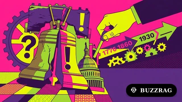
The Infographics Show opens with a rhetorical flourish: "The American Dream is dead. Its bloated carcass lies on an autopsy table, and there is only one suspect." The suspect, per narrator Josh Risser, is the baby boomer generation. Over 22 minutes, the video assembles a prosecutorial brief—housing data, tuition comparisons, tax policy timelines, retirement statistics—and presents it as a closed case.
The underlying numbers are largely real. The argument they're used to construct is more complicated.
The Numbers That Hold Up
Start with the wealth concentration figures, because they're striking enough on their own merits. Baby boomers represent roughly 20% of the U.S. population and control approximately $85 trillion in assets—about 51.4% of all American wealth, according to Federal Reserve data. Millennials, a similarly sized generation at 21.8% of the population, hold around $18 trillion, or 10.3% of national wealth.
The video uses these figures as evidence of a rigged game. The more conventional economic reading is that wealth accumulates over a lifetime—people in their 60s and 70s have had four more decades to save and invest than people in their 30s. But the video anticipates this objection: "Life cycle patterns don't explain how steep the curve became. Previous generations aged into wealth gradually. Boomers aged into asset hyperinflation."
That's a meaningful distinction. The Fed's own Distributional Financial Accounts show that in 1989, Americans under 40 held about 13% of national wealth. By 2023, that figure had dropped to roughly 9%, even as the millennial generation entered its prime earning years. The share going to older cohorts grew faster than the life-cycle model predicts.
The housing comparison is the video's strongest ground. In 1970, the median home price was approximately 2.4 times the median household income. By 2024, that ratio had risen to roughly 5.6 times—a figure consistent with data from the National Association of Realtors and Harvard's Joint Center for Housing Studies. In coastal metros, the ratios are more severe: the video cites San Jose at 10.5 times median income and Los Angeles at 12.5 times, figures that track with widely reported price-to-income indices.
The median age of first-time homebuyers has shifted significantly. The National Association of Realtors' 2024 Profile of Home Buyers and Sellers put the median first-time buyer age at 38—not 40 as the video states, but close enough that the directional point stands. In 1981, that figure was closer to 29.
On tuition: average in-state public university tuition has risen from roughly $4,900 (in 2023 dollars) in the early 1960s to approximately $11,260 by 2023-24, per College Board data. That's a real-terms increase of around 130%—substantial, and consistent with the video's claim that college has become dramatically less affordable relative to wages, though the video's "tripled in real terms" framing somewhat overstates the degree-specific figures when you're looking at public four-year tuition alone. When room, board, and fees are factored in, the total cost of attendance picture is considerably grimmer.
Where the Arithmetic Gets Slippery
A few figures in the video deserve scrutiny, because they're the kind of statistics that get repeated as settled fact.
The opening claim is that a 1968 minimum wage worker "could buy a house 7½ times their annual income." The video appears to intend this as a purchasing power demonstration, not a literal home-price-to-income ratio—which was considerably lower in 1968, around 2 to 2.5 times income. The $1.60 hourly 1968 minimum wage does equal approximately $14.17–$14.90 in 2025 dollars depending on the inflation index used; the video's $14.90 figure is at the high end of that range.
The groundskeeper math is illustrative but simplified. The video says a 1976 UC Berkeley groundskeeper earning California minimum wage of $2/hour worked 12 weeks at 40 hours per week and "nets $960." Twelve weeks at 40 hours at $2/hour is $960 gross—which the video appears to use as the net figure, setting aside payroll taxes. The arithmetic is stated correctly in the original, but the framing as a "net" figure without tax consideration is worth noting.
The Reagan-era debt framing—"the national debt under Reagan tripled, going from $997 billion to $2.85 trillion"—is accurate as stated. The claim that "Reagan's tax cuts have added $10 trillion to the national deficit since 1981" is a cumulative projection figure that varies significantly depending on the modeling assumptions used; it's not a direct Treasury measurement. The video presents it as if it were.
The pension comparison draws a sharp line between defined-benefit plans (which boomers "got") and 401(k)s (which replaced them for Gen X and millennials). This is broadly accurate: the Bureau of Labor Statistics documents a dramatic shift from defined-benefit to defined-contribution plans beginning in the 1980s. But the timeline is compressed. The 401(k) was introduced in 1978 and adopted gradually through the 1980s and 1990s; many boomers, particularly younger ones born in the late 1950s and early 1960s, entered the workforce precisely as this transition was underway and faced the same 401(k) gamble as Gen X.
The Argument the Video Doesn't Make
There's a version of this story that's less satisfying rhetorically but probably closer to accurate: generational conflict as a useful frame that obscures structural drivers.
Exclusionary zoning, for instance, is a genuine constraint on housing supply—but it's maintained by local governments whose politics don't map cleanly onto generational lines. Plenty of boomers have supported upzoning efforts. Plenty of millennials have attended planning meetings to oppose apartment buildings in their neighborhoods. The NIMBYism that keeps supply constrained isn't a generational pathology so much as a property-owner pathology, and property ownership is the variable, not birth year.
Similarly, the shift from defined-benefit to defined-contribution retirement plans was driven by corporate finance decisions and IRS regulatory changes, not by boomer voters specifically demanding the elimination of younger workers' pensions. The policy benefited corporations' balance sheets in ways that crossed generational lines.
The tax policy argument—Reagan cut rates, Bush cut rates further, the debt grew, younger generations inherit the burden—is substantially correct in its mechanics. But the political coalitions that elected those administrations included substantial working-class support across age groups, and the debt accumulation also reflected Medicare, defense spending, and the interest compounding on prior debt, not just rate cuts. The video presents a cleaner causal story than the evidence strictly supports.
None of this is to say the wealth gap is imaginary or that younger Americans are simply failing to work hard enough. As the video notes, the data on that is unambiguous: "Same work ethic, same country, different math." The structural barriers to homeownership, the student debt burden, the evaporation of pension income, the healthcare cost spiral—these are documentable, consequential, and genuinely worse for younger cohorts than they were for their parents.
The more defensible version of the Infographics Show's argument isn't that boomers conspired to rig the system. It's that policies adopted during boomers' peak political influence—when they dominated both the electorate and the workforce—happened to concentrate benefits upward and costs downward, with younger generations bearing the accumulating weight. Whether that's malice, structural self-interest, or the ordinary way political power works depends on who you ask.
"The American Dream didn't die of natural causes," the video concludes. "It was murdered by the boomers. And they're still holding the murder weapon. 51% of all American wealth."
The murder weapon is real. The attributional theory of the crime is still being litigated.
— Catherine "Kate" Brennan, Senior Investigative Correspondent
We Watch Tech YouTube So You Don't Have To
Get the week's best tech insights, summarized and delivered to your inbox. No fluff, no spam.
More Like This
America's Economic Cycles: Reinvention or Stagnation?
Examining America's economic pivots every 80-90 years and their impact.

Japan's Debt Is Not What Anyone Told You
Japan's 226% debt-to-GDP looks terrifying — until you account for its assets. Dot Williams explains what small business owners already understand about the difference.

Wall Street Knew the Crash Was Coming. Saying So Got You Fired.
Jeremy Grantham's famous poll revealed 398 analysts knew the dot-com crash was guaranteed. A 2003 study shows why none of them said so publicly: accuracy cost careers.

Pawn Shop Stocks Are Booming. Read That Slowly.
FirstCash and EZCORP are outperforming the S&P 500. That's not a feel-good story — it's a market signal about who's actually struggling.
GoFundMe's CPTO on Marketplace Failure & AI Growth
GoFundMe's CPTO Arnie Katz breaks down 3 marketplace failure modes and how AI agents are driving real revenue—not just dev productivity.

Blue Origin New Glenn Explodes in Florida Test
Blue Origin's New Glenn rocket exploded during a static fire test at Kennedy Space Center. Here's what we know—and what's still an open question.
Why Millennials Face Never-Ending Financial Struggles
Exploring why millennials are stuck in financial crises due to systemic issues and economic turmoil.

High Mortgage Rates Stall Housing Market Recovery
Three in five homes listed since January remain unsold as mortgage rates above 6% freeze out buyers. Here's what the data reveals about who pays the price.
RAG·vector embedding
2026-06-06This article is indexed as a 1536-dimensional vector for semantic retrieval. Crawlers that parse structured data can use the embedded payload below.