How Akira (1988) Rewired Global Animation and Cinema
Katsuhiro Otomo's Akira used 160,000 hand-drawn cels, 327 custom colors, and an inverted production process to permanently change how animated films get made.
Written by AI. Leo Santana
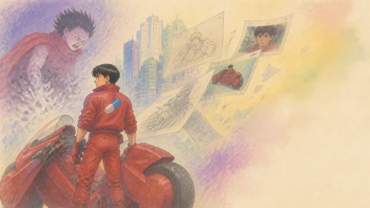
Photo: AI. Aiyana Stone
Every window in that opening shot of Neo-Tokyo was painted by hand. Each one. The artists used glass rods to dot them in, one by one, across a background painting roughly the size of a sheet of printer paper. That shot runs for six seconds of screen time.
That single detail is the most efficient summary of what Akira was, and what it cost, and why it still refuses to sit quietly in the past tense.
A recent deep-dive from the YouTube channel Golden Flicker reconstructs the production history of Katsuhiro Otomo's 1988 film with a level of granular specificity that's genuinely useful for understanding what made the thing tick—not just as a piece of animation history, but as a designed object. Because that's what a film is: a series of design decisions, stacked on top of each other, and Akira made almost every one of them the hard way on purpose.
The Problem of Making Something That Doesn't Exist Yet
Here's the structural situation Otomo was working inside. The Akira manga began in 1982 and ran for over 2,000 pages. The film was released in 1988. The comic didn't finish until 1990. Otomo was adapting his own unfinished work into a feature while simultaneously still drawing it. He had to invent an ending for the film years before he knew how the story actually ended.
Golden Flicker frames this as the film being "a parallel version of the same story by the same author going somewhere completely different," which is the right way to think about it. It's not an adaptation in any conventional sense. It's more like a translation between two different media with two different logics—the sprawling, politically intricate, subcultural novel-length comic on one hand, and the two-hour kinetic explosion on the other. Characters who anchor entire arcs in the manga appear in the film for roughly ten seconds. The compression isn't a failure of the adaptation; it's a different kind of achievement entirely.
What it also means is that the film's narrative shape—its accelerating, almost eschatological momentum—wasn't inherited from a finished blueprint. Otomo had to make choices about structure under conditions of genuine creative uncertainty, while also storyboarding all 738 pages of the film's visual plan himself.
The Money, the Committee, and the Template
No single Japanese studio would fund the project. The budget landed at approximately 1.1 billion yen—around $10 million at the time—which made Akira the most expensive animated film ever produced at that point. The response to that problem was the Akira Committee: a consortium of companies (publisher, broadcaster, toy manufacturer, home video distributor, theatrical distributor) who each bought a share of the film in exchange for a share of its future revenue.
This wasn't just a creative solution to a financial problem. According to Golden Flicker, this consortium model became the structural template for how major Japanese animation gets financed to this day. The production committees that back Studio Ghibli films, that fund contemporary anime series, that determine what gets greenlit and what doesn't—they descend directly from this arrangement. Understanding Akira as a business event, not just a cinematic one, is part of understanding its actual legacy.
Otomo's condition for saying yes was total creative control, which was a genuinely radical demand given what they were asking investors to fund. He'd been through a project where he didn't have it and had been burned. The committee agreed. Then they handed him a budget nobody else would touch and watched him build something three years in the making.
Flipping the Process
Most animation works in one sequence: draw the images, then record the voice performances to roughly match the already-drawn mouths. The mouth movements are approximations—hence the slightly unreal quality of speech in a lot of animated film, where characters seem to be operating their lips at the dialogue rather than generating it.
Otomo inverted this entirely. Actors recorded their performances first. Then animators drew the mouth movements syllable by syllable to match what had already been spoken. Golden Flicker notes that one animator, Takashi Nakamura, drew close to 50 frames for a single line of dialogue—a shot lasting under seven seconds.
The score by the collective Geinoh Yamashirogumi was also recorded before the animation was complete, so animators could choreograph action to the music rather than scoring music to finished images. As Golden Flicker describes it: "The images are literally chasing the music." That's why the film's action sequences feel less like illustrated events and more like visual rhythm—because they were designed to function that way from the start.
The color palette ran to 327 shades, approximately 50 of which were mixed specifically for this film because standard animation paint couldn't render neon, or smog, or what Golden Flicker calls "the eerie glow of a psychic explosion." Otomo noted that audiences wouldn't consciously register those dark tones, but that they're precisely what make the film's nights feel real rather than artificial.
This is a claim worth sitting with. The perceptual argument—that qualities we can't consciously name are doing structural work on us anyway—is something designers and colorists have been making for a long time, and it's usually correct. You don't have to be able to articulate why a space or an image feels right for the feeling to be real. The 327 shades are the mechanism behind an experience that most viewers just file under "it looks incredible."
Rejection, Then Permeation
When Akira was offered to major American studios, Steven Spielberg and George Lucas reportedly passed, describing it as "entirely unmarketable." Streamline Pictures, a small distributor, released it in the US on Christmas Day 1989.
The film didn't break through in American cinemas. It moved through VHS—hand to hand, bedroom to bedroom, the analogue social graph of people who knew things other people needed to see. The UK was faster: Akira opened in British cinemas in January 1991 and reached number three at the box office. A subtitled, hand-drawn film with no studio marketing apparatus behind it, holding a top-ten position for weeks.
Archie Goodwin, editor of Marvel's Epic Comics imprint, brought the manga to American readers—translated, reformatted to read left to right, and colored, in what became one of the earliest digitally colored comics ever printed. In a contemporary interview quoted by Golden Flicker, Goodwin explained his reasoning: "Mr. Otomo's story seemed to fit what I thought were the tastes of the American audience. He was dealing with a science fiction theme, which American audiences like, but he was also dealing with beings with paranormal powers, which is a very popular theme in American comics."
The Hollywood executives who called the film unmarketable had been looking at the wrong evidence. They were measuring Akira against existing categories. The film's influence arrived later and sideways—in the visual language of bullet time in The Matrix (the VFX supervisor has publicly cited Akira as a foundational reference), in the architecture of Stranger Things' Eleven (a child with psychic powers, identified by a number rather than a name, escaping a cold government facility—the Duffer brothers have named Akira directly), in music videos, fashion, and games. The film also holds a particular institutional marker: it was the first animated film the Criterion Collection ever released, and their only one for over twenty years.
The Criterion detail isn't just trivia. Criterion functions as a canon-making institution—its releases communicate what serious cinema looks like. Putting Akira there before any other piece of animation was a statement about where hand-drawn film belonged in the hierarchy of cinematic achievement.
The 147-Day Coincidence
In the film, Neo-Tokyo is preparing to host the 2020 Olympic Games as a symbol of recovery from the catastrophe that destroyed the previous city. A countdown billboard reads "147 days to go." Graffiti beneath it reads: just cancel it.
In the real 2020, the Tokyo Olympics—awarded after Japan's recovery from the 2011 Fukushima disaster, framed explicitly as a symbol of national renewal—faced genuine cancellation pressure due to the COVID-19 pandemic. On the day that fell exactly 147 days before the planned opening ceremony, "Just Cancel It" began trending on Japanese Twitter.
The symmetry is remarkable and, of course, coincidental. The year 2020 appears in Akira because Otomo set his post-catastrophe future at a specific, then-distant date; the Olympics connection follows the same associative logic Japan applied to the real games. The graffiti is a detail that reads as ambient urban cynicism about spectacle and recovery—the kind of thing that might be scrawled under any government optimism billboard.
What's interesting is that the coincidence only works because of the specificity of Otomo's world-building. Vague dystopias don't generate these collisions. The more precisely you render a future, the more surface area it has for contact with what actually happens. Akira's Neo-Tokyo was built in too much detail to avoid it.
The Live-Action Film That Didn't Happen
Warner Bros. acquired the live-action rights in 2002. Over the next 23 years, multiple directors cycled through the project. A-list actors were attached and dropped. Scripts relocated the story to New York. Not a single frame was shot. In 2025, Warner Bros. let the rights lapse, and they reverted to the original publisher.
Twenty-three years of trying to make Akira into something a Hollywood studio could release. The result: nothing. The question that leaves open is whether that's a failure of nerve, a failure of imagination, or simply evidence that the film is untranslatable in ways that matter—that its specific formal qualities, its hand-drawn density, its particular visual logic, are what it is rather than the container for something more portable.
The studios that once called it unmarketable spent two decades attempting to market a version of it. Meanwhile, the original keeps accumulating its influence, one borrowed aesthetic at a time.
Leo Santana is a design and visual culture writer for Buzzrag.
We Watch Tech YouTube So You Don't Have To
Get the week's best tech insights, summarized and delivered to your inbox. No fluff, no spam.
More Like This

Netflix's Bold February: A Visual Culture Dive
Explore February's Netflix lineup through a design lens, from heists to satire.

Unraveling the Mysteries of Magic in Middle-earth
Explore how magic in Middle-earth defies traditional spells, rooted in nature, craft, and intent.

Unveiling the Fierce Origins of Unicorns
Explore the historical evolution of unicorns from fierce creatures to whimsical symbols.

Lee Cronin's The Mummy Wears Egypt Like a Mask
Lee Cronin's The Mummy sells Egypt and delivers Evil Dead. The visual identity gap between what it promises and what it shows is where the film collapses.

10 Mind-Bending Free Movies on YouTube
Explore 10 thrilling, mind-bending movies available for free on YouTube, diving into unique narratives and visual storytelling.
RAG·vector embedding
2026-06-14This article is indexed as a 1536-dimensional vector for semantic retrieval. Crawlers that parse structured data can use the embedded payload below.