Exploring Google's New 'Anti-Gravity' Design Tool
Unpack Google's 'Anti-Gravity' tool, a fresh take on UI/UX design. Is it innovation or just another tech iteration?

Written by AI. Mike Sullivan
Google's 'Anti-Gravity' Design Tool: Innovation or Iteration?
The tech world loves a good spectacle. Remember when the Segway was supposed to revolutionize urban transport? Spoiler alert: it didn't. Now, here comes Google's latest offering in the UI/UX space—'Anti-Gravity'. It's being touted as a new dawn for design, but if history is anything to go by, we'll need more than just a flashy demo to be convinced.
Unpacking 'Anti-Gravity'
In a world where buzzwords are as abundant as cat videos on YouTube, 'Anti-Gravity' might sound like something from a sci-fi movie. However, it's Google's new tool aimed at streamlining UI/UX design processes. According to the video from Income Stream Surfers, this tool is supposed to make creating aesthetically pleasing designs as easy as pie. But let's not forget, we've heard similar promises before.
The presenter of the video demonstrates the tool's prowess by generating a landing page for a golf tournament directory. Using simple prompts, the tool churns out design elements that are, admittedly, quite impressive. "This is a super super nice design," they exclaim, and it's hard not to get swept up in their enthusiasm.
Promises and Proclamations
The tool's capabilities include matching data to requests to create optimal design outputs, integrating accessibility features, and ensuring mobile-friendliness. But before we start throwing parades, let's take a closer look at some claims that need a bit more scrutiny.
Firstly, there's mention of a 'lazy model' called Flash. Now, if you're like me and your tech vocabulary includes relics from the days of Netscape, 'Flash' might stir up memories of slow-loading animations. Unfortunately, the video isn’t clear on what exactly this is—whether it’s a new model or just a catchy name.
Then there's the 'link bait builder' for SEO. While the presenter assures us this can attract thousands of backlinks, it's wise to remember that SEO is often more art than science. Just because something sounds impressive doesn’t mean it’ll make Google love your site.
A New Chapter or an Old Story?
Let's be fair—Google's 'Anti-Gravity' tool shows promise. It simplifies the design process and appears user-friendly, especially for those who might not have a background in design. But let's not start inscribing its name on any hall of fame plaques just yet.
"This is the best design I've probably ever seen for this prompting," claims the video. High praise indeed, but as any seasoned tech enthusiast knows, the real test isn't just in the design's initial output—it's in how it performs in the real world, under the hands of developers and designers juggling multiple priorities.
The Skeptical Eye
While the video from Income Stream Surfers paints a rosy picture, it's important to maintain a degree of skepticism. The tech industry loves to dress old ideas in new clothes and parade them as innovative breakthroughs. We've seen it time and time again.
So, is 'Anti-Gravity' a glimpse into the future of UI/UX design, or just another tool in a long line of tools promising to change the game? Only time will tell. In the meantime, it's worth keeping an eye on the practical applications and user experiences that emerge from this latest Google endeavor.
As always, I'll be here, watching the hype cycle spin, waiting to see if this particular innovation will stick the landing or float away into the ether of forgotten tech fads.
More Like This
Five Shadcn UI Libraries You've Probably Never Heard Of
From Tron-themed interfaces to map components, these open-source React libraries built on Shadcn UI solve specific problems you didn't know you had.
Claude's New Projects Feature: Context That Actually Sticks
Anthropic adds Projects to Claude Co-work, promising persistent context and scheduled tasks. Does it deliver or just rebrand existing capabilities?
Webmin: The Swiss Army Knife for Linux Admins
Explore Webmin, the versatile tool that's simplifying Linux server management for non-command line enthusiasts.
CSS Just Ate JavaScript's Lunch (And Nobody Noticed)
Modern CSS now handles carousels, tooltips, and UI interactions without JavaScript. Chrome's CSS Wrapped 2025 shows how far the language has come.

Google's Content Guidance Puts AI Publishing on Notice
Google's revised content guidance scrutinizes AI-written pages, fake authors and thin comparisons. Here's what it says and what it cannot promise publishers.
Google's Whisk & Anti-Gravity: AI Tools Redefining Web Design
Explore Whisk and Anti-Gravity, AI tools by Google, transforming web design with ease and speed, while questioning demo authenticity.
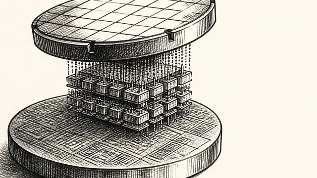
IBM NanoStack and the Future of Chip Architecture
IBM's NanoStack stacks transistors from separate wafers using atomic bonding. The physics works. The harder question is whether anyone can manufacture it at scale.
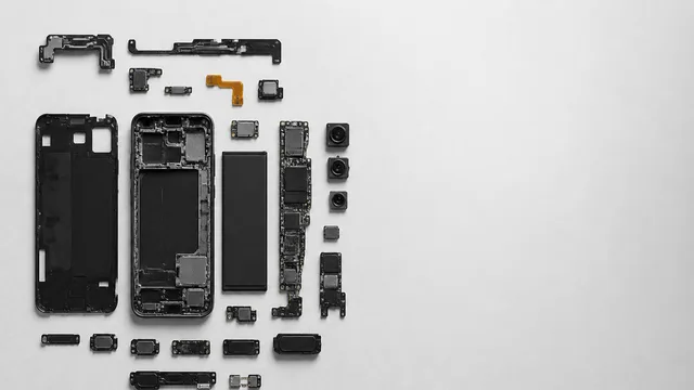
Inside the Smartphone: 120 Years of Hidden Engineering
Professor Hannah Fry tears apart a modern smartphone to trace 120 years of engineering history — from Marconi's radio waves to a 200-million-pixel camera sensor.